Victoria’s Secret
2011 to 2015
I managed and designed daily site updates and site launches for the Victoria’s Secret e-commerce site. My responsibilities included seasonal concepting, presentations to senior leadership - including the CEO, and partnerships with multiple teams (catalog design, copywriters, marketing, merchants, photo, and photo retouching). We used A/B testing, customer feedback, customer mindsets, and click rates to optimize the site daily. For each product launch, we designed cohesive design systems that would be used to paint the website to present a unified message. I supported the UX team in optimizing web functionality, site architecture, user interface, and navigation.
Sr. Web DesignerArt Direction
E-commerce DesignEditorial Design
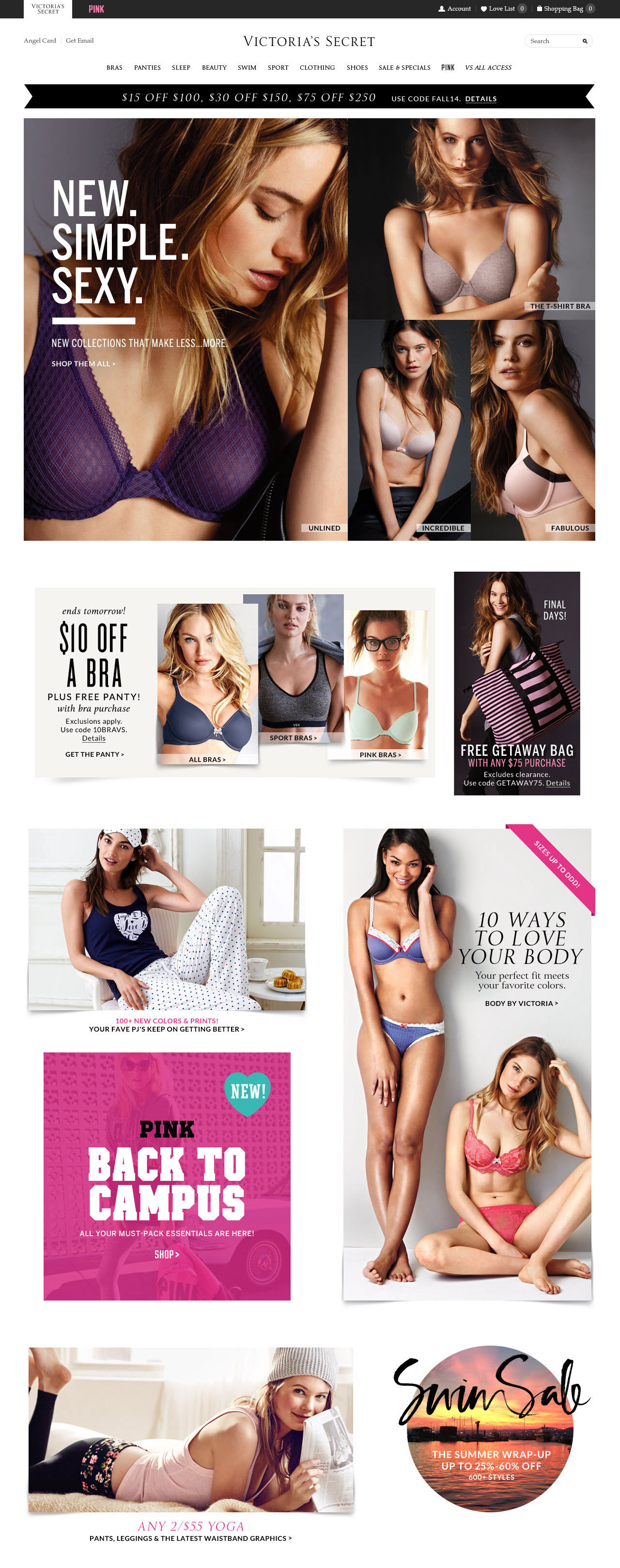

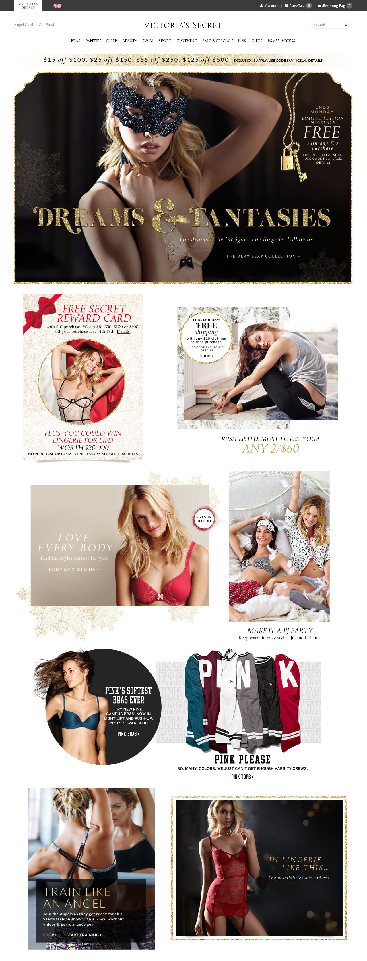
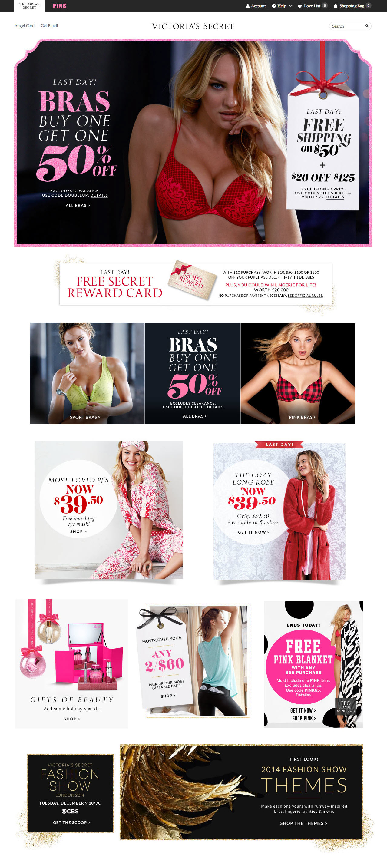
Product Launch Campaign
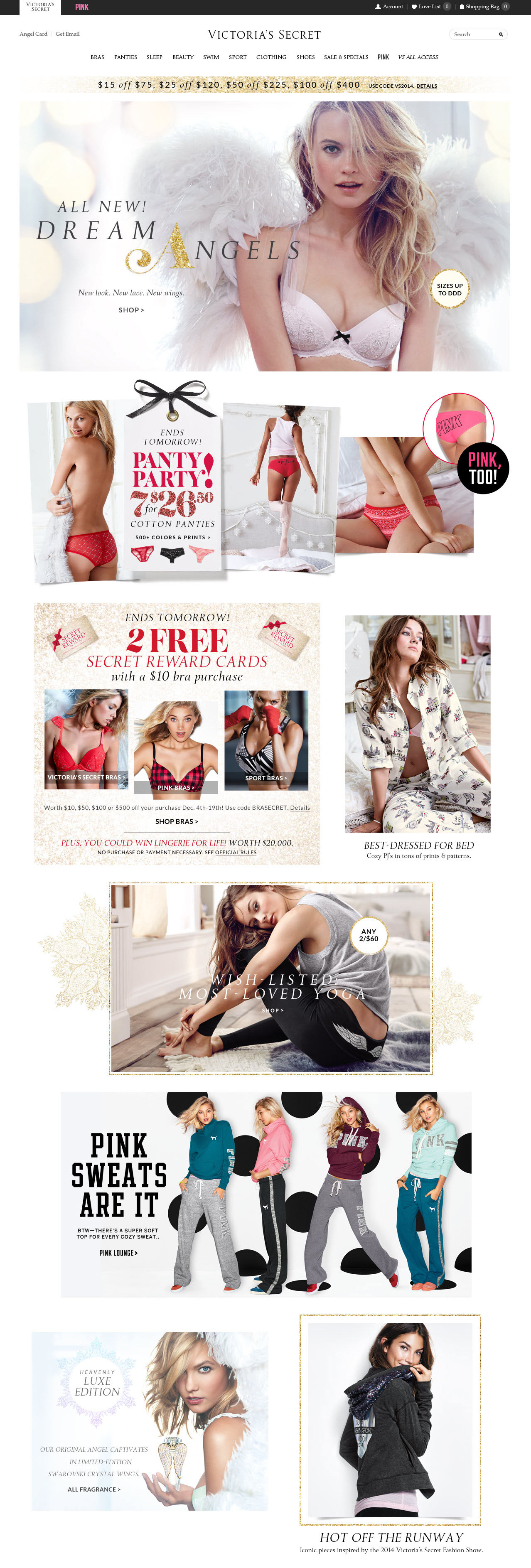
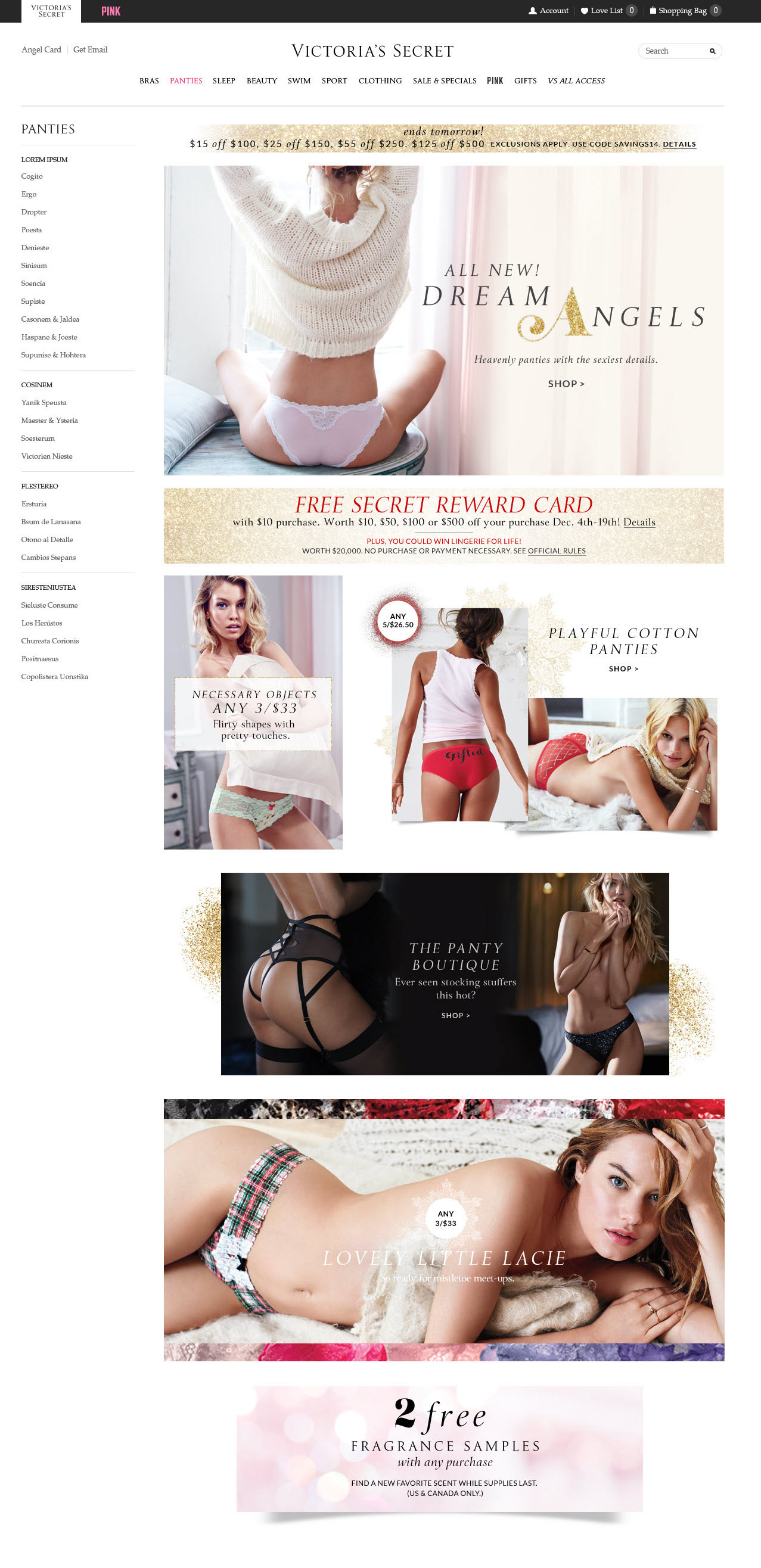
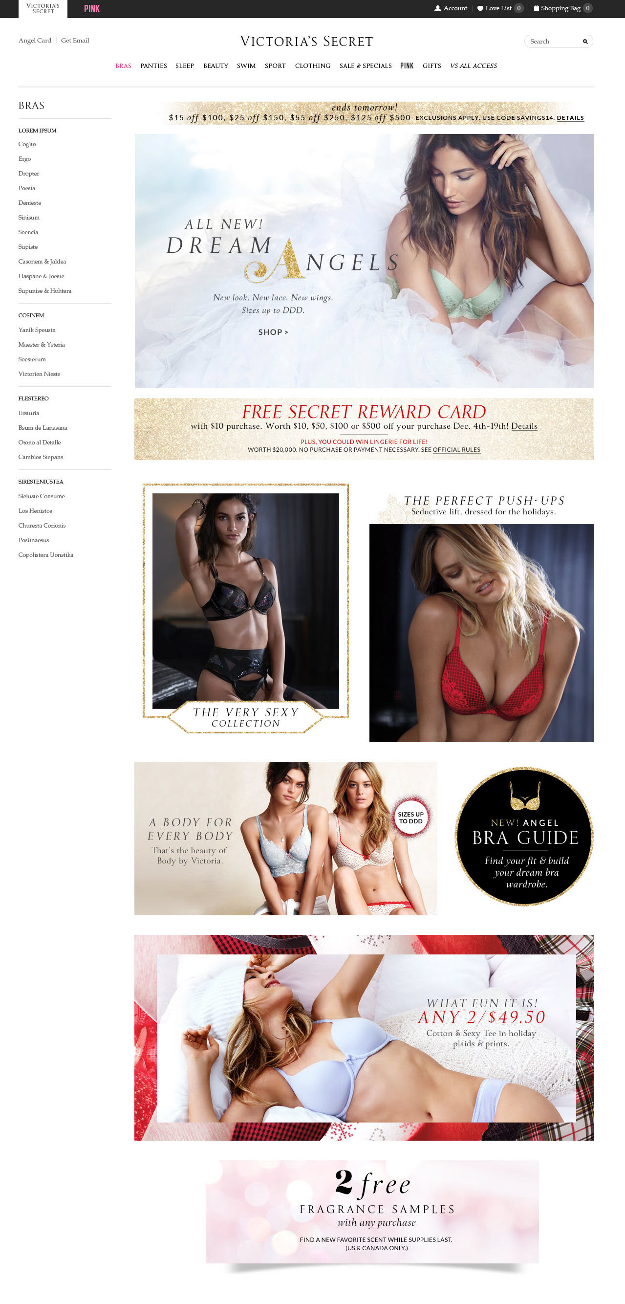
The pages below show how the product launch design system was carried across multiple category pages.

A/B Testing
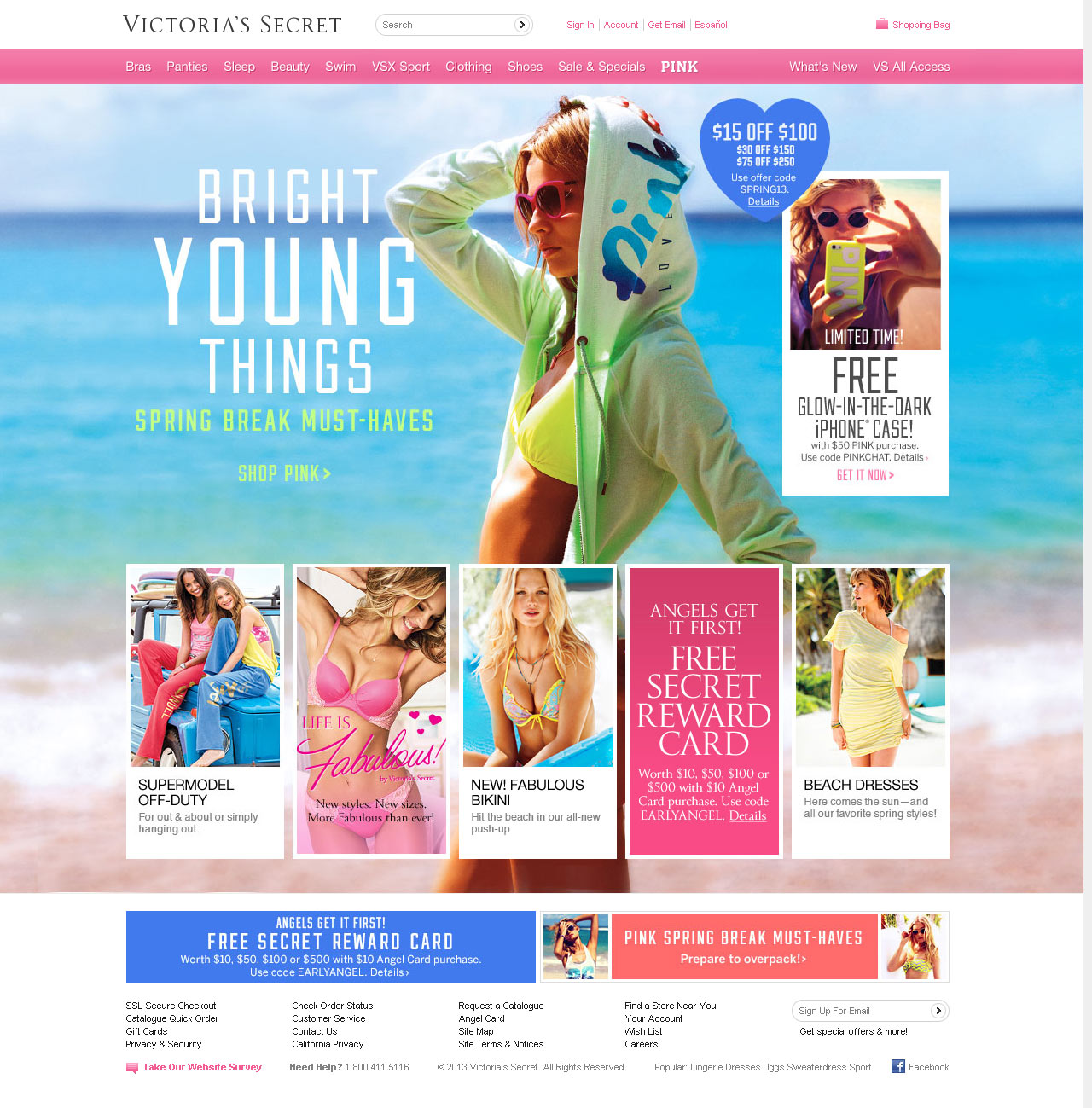
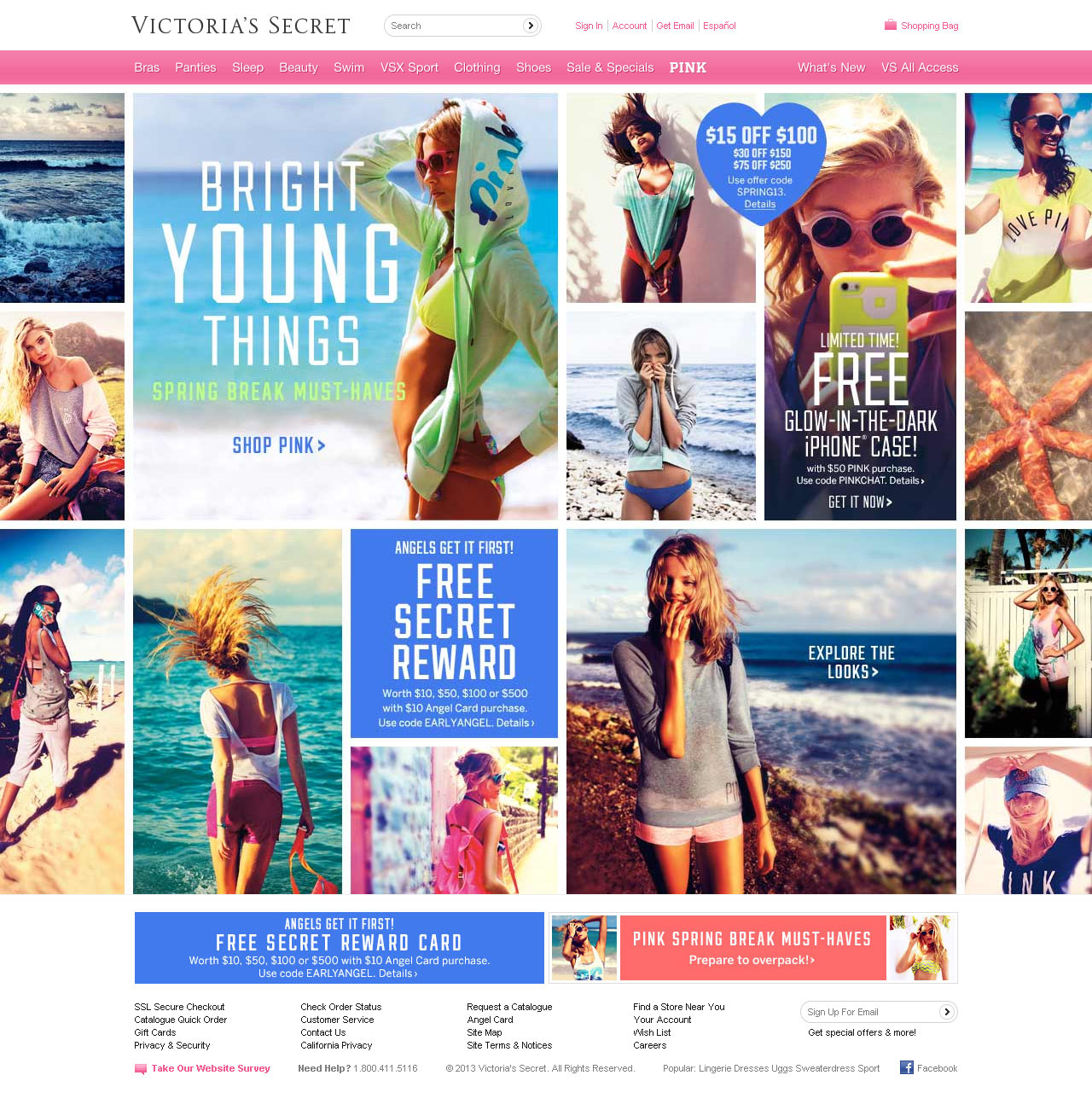
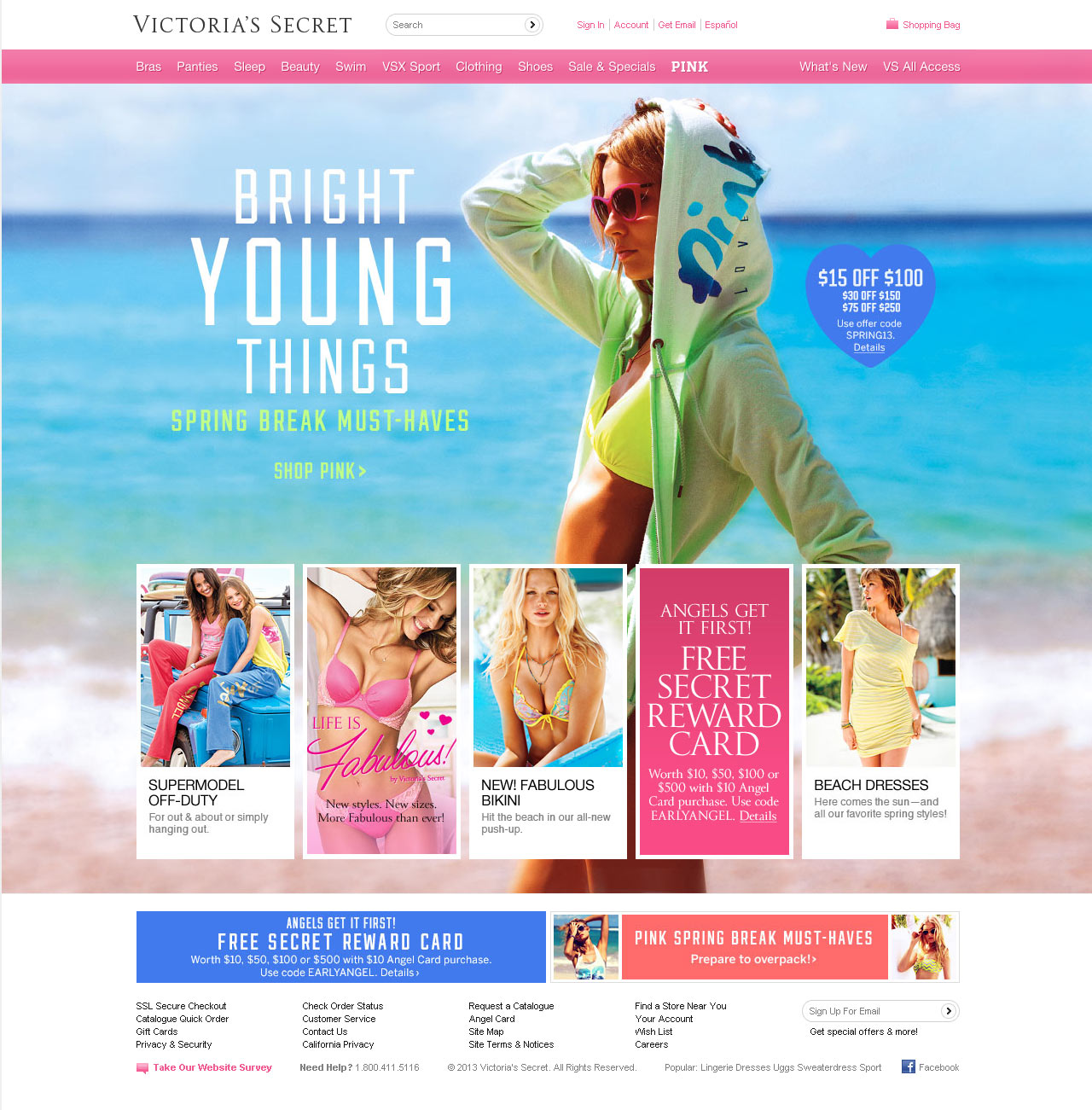
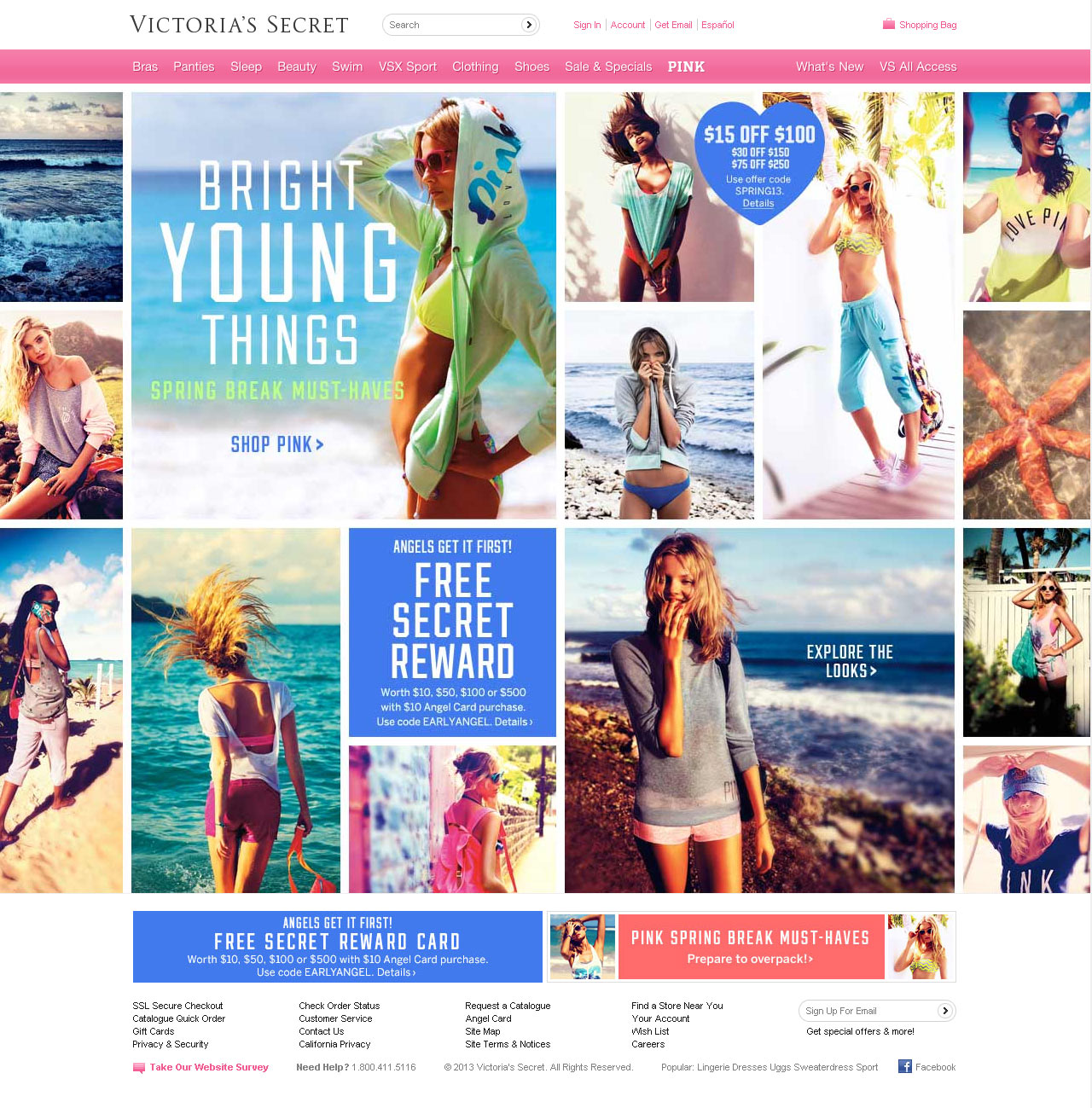
The screens below show an unusually complex A/B test to see if the visual layout of the homepage affected click through rates. When doing giveaway offers, we always designed a control without the gift for when it ran out, making this test require four designs.
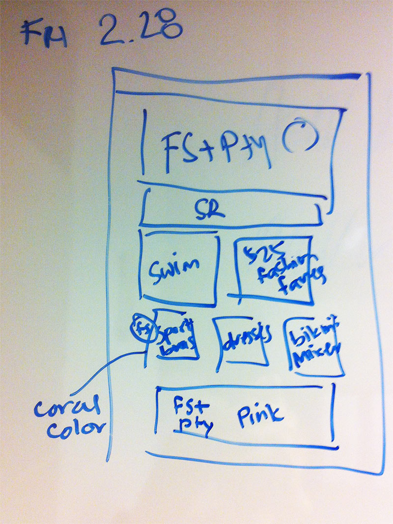
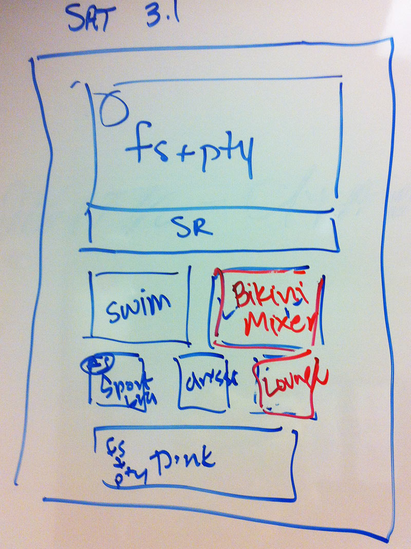
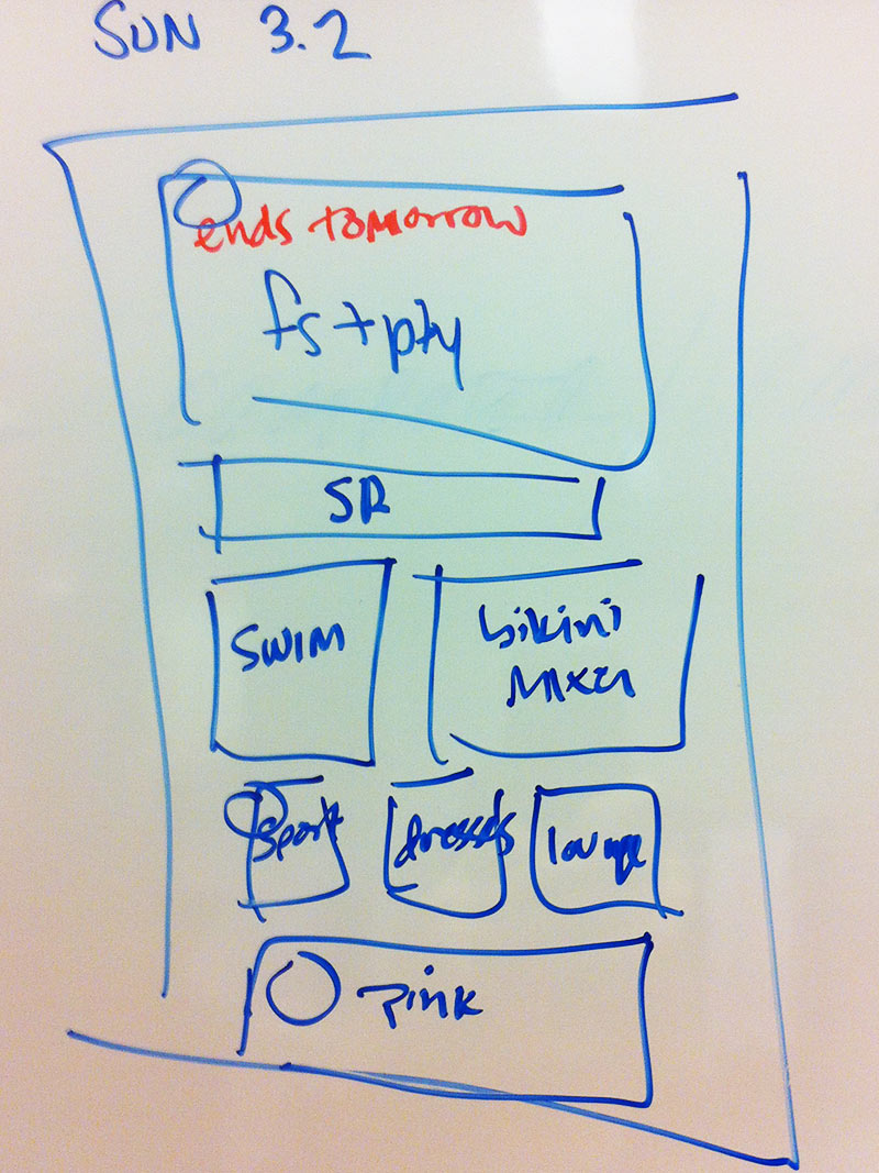
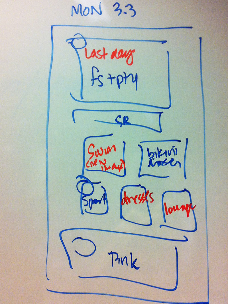
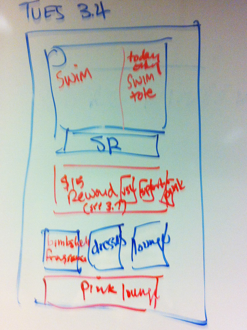
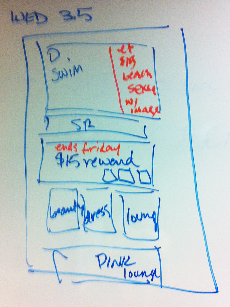
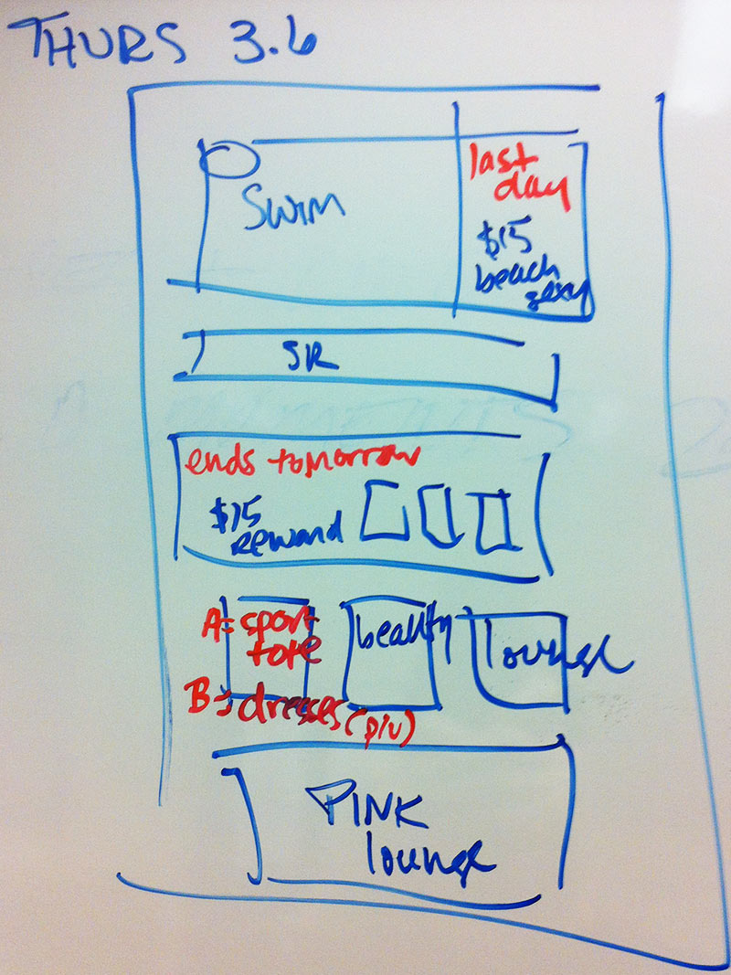
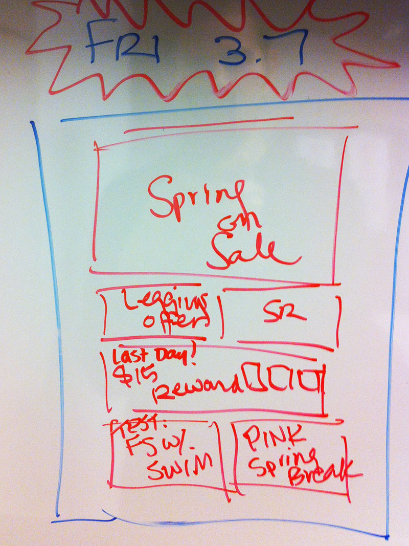
Wireframing Site Updates
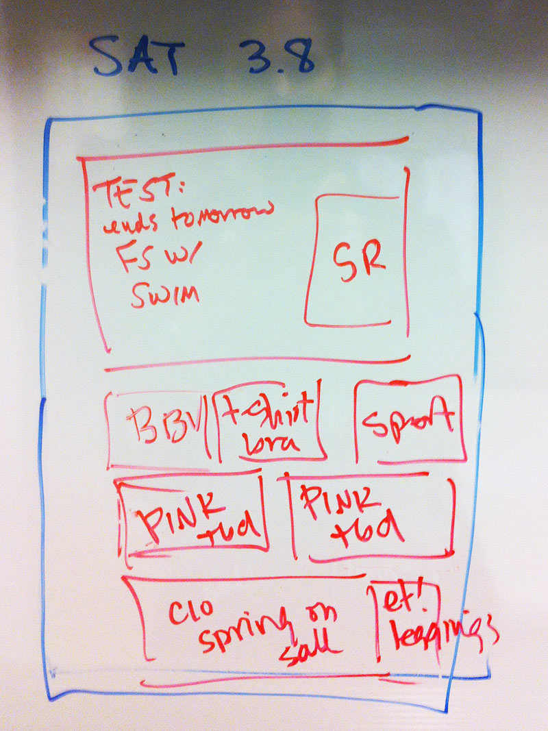
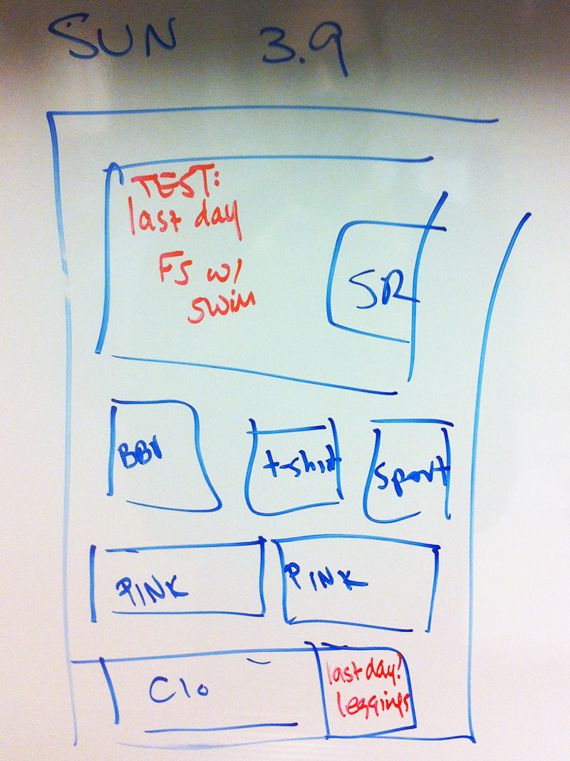
At Victoria's Secret, we would get a list of priorities for each day for each page of the website from the product merchants. Below is an example of how the homepage could evolve each day over a single week, with the red marker signaling a change. It was important to wireframe out these designs with the art director before producing high fidelity comps because the design work was very intensive for each section.
